
From "I Do" to "Wow": Redesigning My Brother's Wedding Photography Website


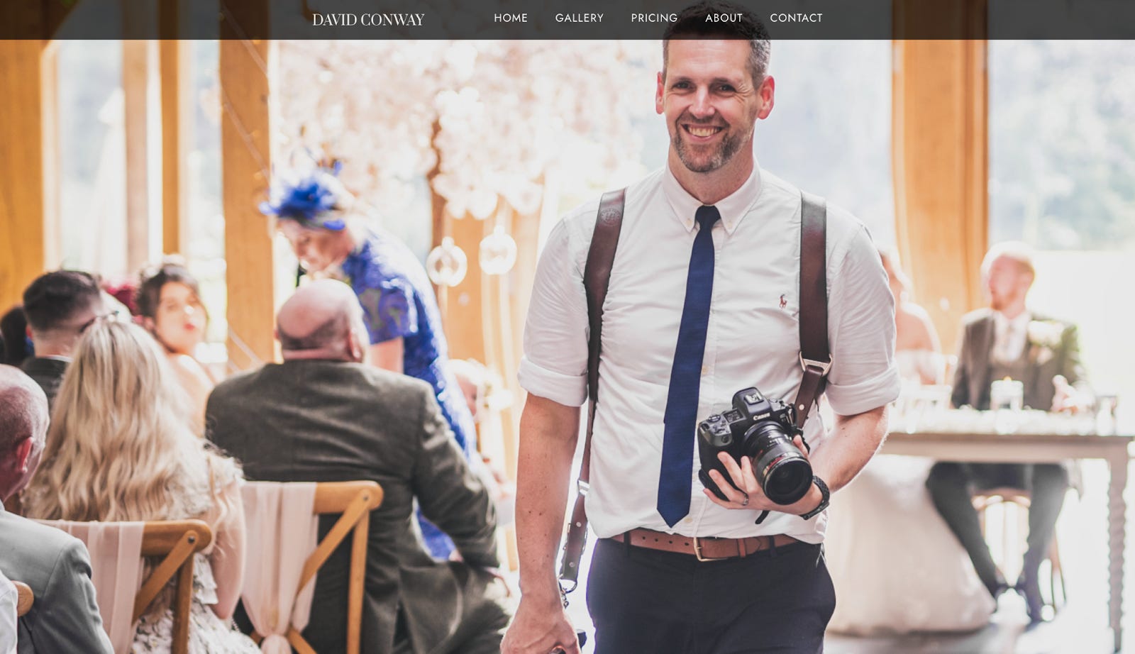
Introduction: A Brotherly Side Hustle Hey there! So, I've been knee-deep in a side project that’s both fun and slightly nerve-wracking: redesigning my brother David’s wedding photography website. David’s been capturing big days for 15 years, and he’s incredible at it - like, tears-in-your-eyes good.
But the website needed some TLC. And by "TLC," I mean a total overhaul.
Our goal: Increase his income per wedding by 30% and making bookings as smooth as butter - all with a shiny new automated marketing funnel. Here’s the inside scoop on how we did it.
Step 1: Research…and a Reality Check We started by really getting to know David’s dream clients. Spoiler: they’re not just looking for pretty pictures (though David’s are stunning). We talked to 10 people who’d spent £20-50k on their weddings—friends, colleagues, and a few strangers. Turns out, the biggies for them were:
Rapport: They want to vibe with their photographer. Like, hang-out-and-have-a-coffee vibe.
Style: Think Vogue meets Waitrose. High-end, classy, but approachable.
Picture Quality: This is a given. If your portfolio doesn’t scream "amazing," you’re not even in the running.
These insights were gold for shaping the site’s design and tone. Lesson learned: It’s not just about the photos; it’s about connection.

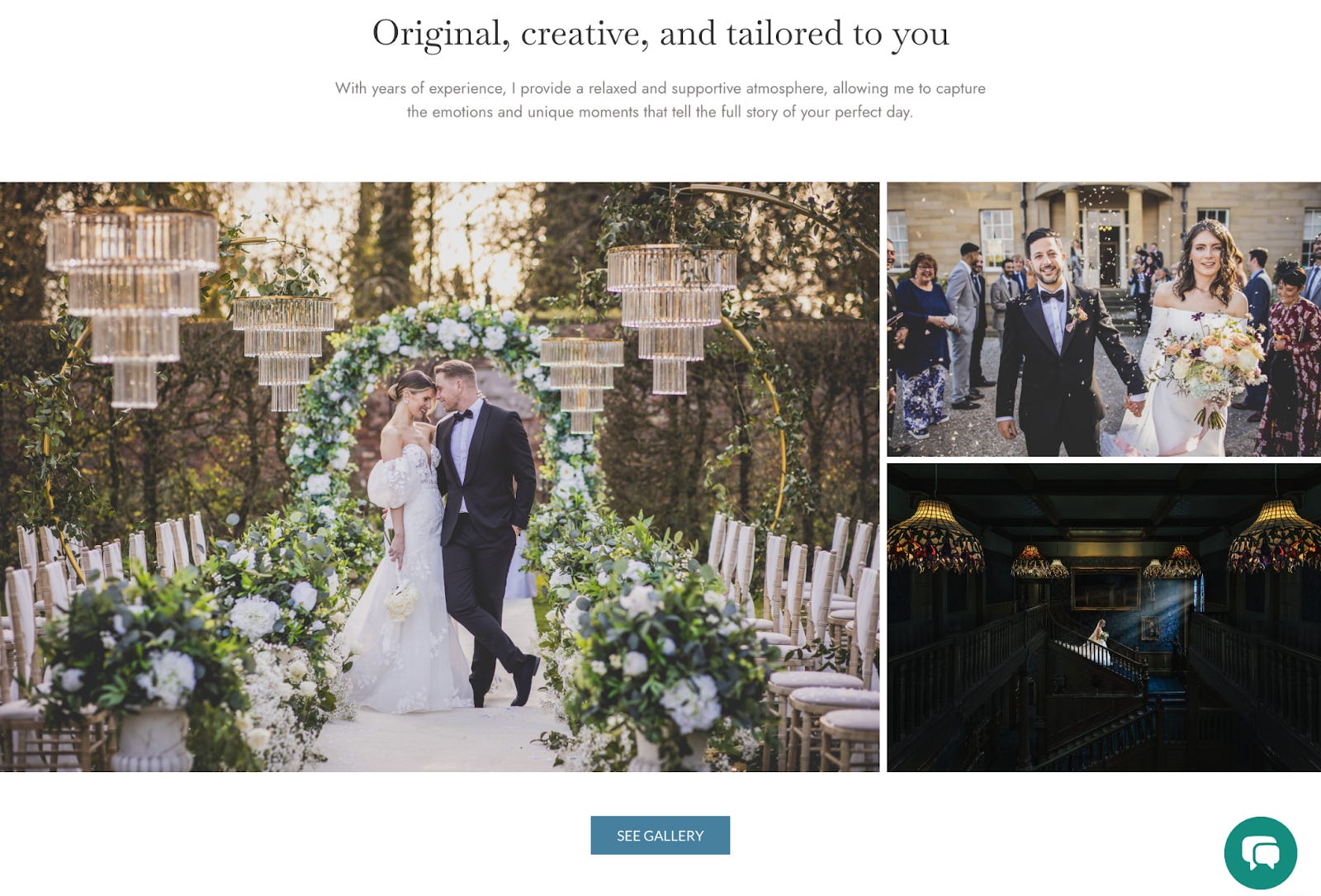
Step 2: Designing for Dream Clients Enter Figma, my trusty sidekick. The design needed to scream high-end while staying functional and user-friendly. A few things I’m particularly proud of:
Minimalist Components: Only about 15 key elements across the site (think headers, hero images, and button styles). Simple, but versatile.
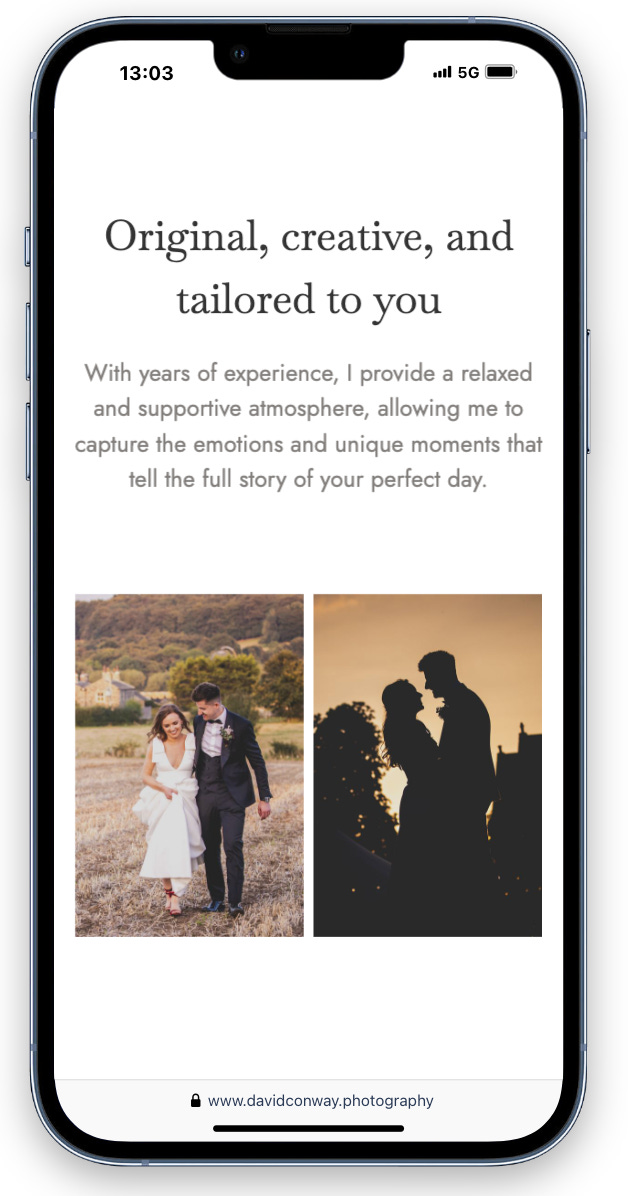
Mobile-Friendly Everything: Because who isn’t scrolling through wedding inspo on their phone?
Sleek Gallery: Filters, a custom-built lightbox, and David’s best work on full display.

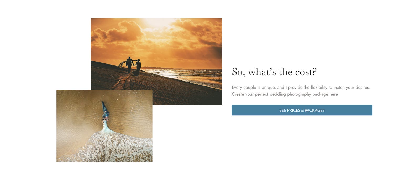
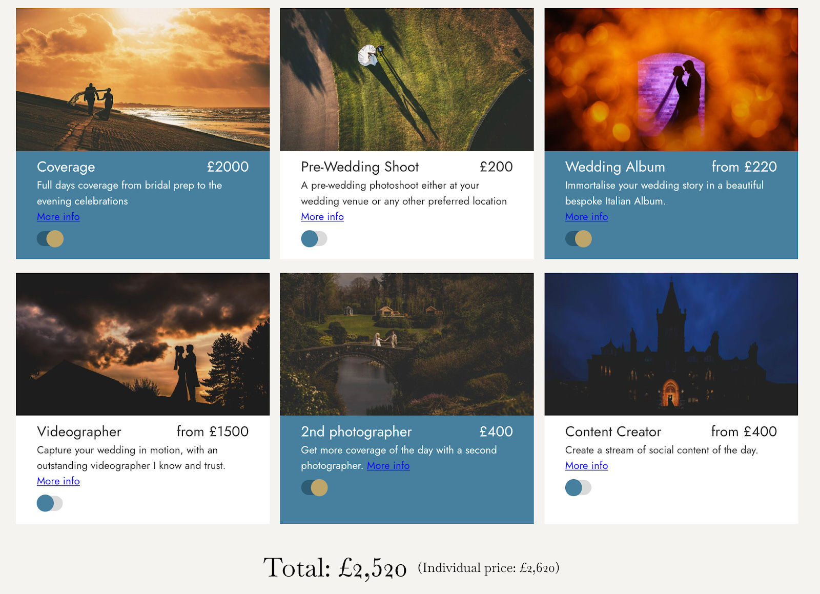
Pricing Page Magic: This went through several iterations. We ditched listing prices upfront and instead used a clever pricing calculator. Visitors submit their email to see tailored options, and boom—we’ve got a lead.
Step 3: Building a Booking Funnel That Works This is where things get fancy. The site doesn’t just sit there looking pretty; it works hard to bring in clients. Here’s how:
Lead Capture Forms at two levels: Potential customers can request pricing, for the cost of a name and email, which instantly takes them to a pricing calculator page. Then, if the prices align to their budget they can check David’s availability with their wedding date and venue. This two stage approach collects valuable details, minimises friction and qualifies leads.
Automated Follow-Ups: Once someone’s in the system, they get a scheduled program of personalized marketing emails. No more chasing leads manually and the improved marketing copy and timeliness drives conversion.
Analytics Integration: With Google Analytics, Heap and Facebook pixels, we’re tracking what we need to optimize. Like, "What’s the bounce rate on the pricing page?" kind of optimization.

Step 4: SEO Sorcery SEO is like an invisible superpower. Here’s what we did to make sure David’s site ranks high and stays there:
Keyword Optimization: From alt text to meta descriptions, we sprinkled relevant keywords everywhere.
Speed Tweaks: Nobody’s waiting for a slow site, so we optimized load times and cleaned up the code.
Backlink Bonanza: A small PR campaign and some clever backlinking helped build authority.
Landing Pages: We created venue-specific pages to target high-end searches like "luxury wedding venues in [insert dreamy location]." this allows indexing on high value search terms on these pages so we can keep the core webpage copy written nicely and keyword light.
More optimizations like meta tags, internal links, schema and URL structure.
Step 5: Google Ads + landing page optimisation We used Landingi, a no code landing page builder, to provide high fidelity insights for optimisation of a landing page. And linked this to a Google Ads campaign for
Keyword Optimization: From alt text to meta descriptions, we sprinkled relevant keywords everywhere.
Speed Tweaks: Nobody’s waiting for a slow site, so we optimized load times and cleaned up the code.
Backlink Bonanza: A small PR campaign and some clever backlinking helped build authority.
Landing Pages: We created venue-specific pages to target high-end searches like "luxury wedding venues in [insert dreamy location]." this allows indexing on high value search terms on these pages so we can keep the core webpage copy written nicely and keyword light.
More optimizations like meta tags, internal links, schema and URL structure.

Results…So Far The site’s live, and the numbers are looking good. We’re seeing a <30% increase in revenue per booking (just as planned!) and a steady flow of leads from the digital funnel. Cold leads - people who’ve never met or had a recommendation for David - are now reaching out, which is a huge win.
And the best part? David has more time to focus on what he loves: capturing love stories.
What’s Next? There’s still work to do - The designs and typography needs another pass. Plenty of room to refine the marketing campaigns and bring down the cost per booking as well as keep the SEO game strong. But overall, this project has been an absolute joy! It’s proof that great design, smart marketing, and a little hustle can take a small business to the next level.
Thanks for reading! If you’ve got any questions about the process (or just need an amazing wedding photographer), drop me a line. Cheers to growth—and to love!
My wonderful collaborators
A huge shout out to the hugely talented and very fun collaborators I worked with on this project. Tracey Rickwood my hands down favourite researcher & visual & UX designer. Gita Ramdhani for black belt webflow skills, and Simon Hogben for SEO and digital marketing brilliance. Genuinely loved working with each of you to bring this website to life. ♥️